

Making of a medieval manuscript: from cover to cover
Through this remarkable manuscript, Gemma Black revealed the craft of the medieval scriptorium, explored the tools, materials and techniques that transformed parchment & vellum into works of enduring beauty.
Learn how pigments were mixed using everyday ingredients such as egg, how pages were ruled and written with extraordinary precision, how gatherings were sewn into robust bindings, and why these precious books have survived for almost six centuries. This is a fascinating glimpse into the artistry, ingenuity and craftsmanship behind one of the Middle Ages' greatest achievements.
This public lecture is sponsored by the Friends of the National Library of Australia.
Making of a medieval manuscript: from cover to cover
Susannah Helman:
Good evening, everyone. My name is Susannah Helman, Senior Advisor in Curatorial and Collection Research section here at the National Library of Australia. It's my great pleasure to welcome you all tonight, whether here at the library or online for this very special event, generously supported by the Friends of the National Library of Australia. I'd like to begin by acknowledging the Ngunnawal and Ngambri peoples, the traditional custodians of the land on which we gather. I acknowledge their ongoing connection to the land and pay my respects to their elders past and present. I extend that respect to all First Nations peoples here with us tonight and online. There is something truly captivating about mediaeval manuscripts, looking slowly and closely at them, studying the artistry and ingenuity with which they were created. As tonight's speaker has done, it's extremely rewarding.
These manuscripts give us a glimpse into a world in which books were created by hand rather than printed en masse and images and decorative flourishes held as much power as the written word. I'm excited to introduce distinguished calligrapher, arts practitioner and scholar, Gemma Black. Gemma's practise focuses on the creation of formal documents on vellum and fine art paper, heraldic works, book inscriptions, calligraphic pieces for citations, certificates, and related commissions. Drawing on more than 30 years of teaching, research and professional practise, she also lectures widely on art, history, the craftsmanship of lettering and the art of the book. Tonight, Gemma will take us on a journey exploring how one of the National Library's treasures, a 15th century book of ours was created. The book she's talking about tonight is a highlight of the Library's Clifford Collection, a large collection of rare books and manuscripts acquired by the library in 1963.
Please join me in welcoming Gemma Black to the stage.
Gemma Black:
Good evening everyone, and thank you for joining me here on Ngunnawal Land. And thank you, Susannah, for your warm welcome and kind words. We have been given a wonderful opportunity to delve into the National Library's collection. And tonight I have chosen to share with you a 15th century Book of Hours from the Clifford Collection, as we've just heard. Plus, I have a stunning little surprise for you at the end, so don't nick out too early. Tonight, I'm going to take you. Oh, that's right. I've got it here. Tonight, I'm going to take you through this manuscript as though we're going on a guided tour. We'll look at the tools and materials used to make it, the gothic liturgical handwriting in iron gall ink, the red rubrics, the lavish floral borders, gold leaf, and those jewel-like miniatures that you can see here. Together, these elements represent manuscript production at a remarkable point in its development.
In this image, we can see the calendar for December on the left and Christ depicted as Salvatore Mundi, saviour of the world. The right side of the manuscript that you can see is called the recto. And when you turn to the next page, it is called the Verso. So many of you know that. Verso though means to turn. So you're always able to remember recto on the right, turn it and it's the verso.
The manuscript dates from around 1460 and was produced in the Southern Netherlands, probably Bruges or Ghent for an English patron. The Library itself describes it as "our most splendid Book of Hours", and that it is. Flemish workshop production produced large numbers of books of hours for the English market, surprisingly to many, and many followed what is known as sarum use. Sarum use refers to the liturgical practises that originated in Salisbury and became widely used throughout England, Wales, and Ireland before the reformation. So here we have something rather interesting, a Flemish made book created for an English owner following an English liturgical tradition. Already this little manuscript is beginning to tell us something about the world in which it was made, and the more closely we look, the more it tells us. When we talk about manuscripts from the Southern Netherlands, it's worth remembering that the political and cultural boundaries of the 15th century were rather different from the ones we know today.
The region that we now think of as the Netherlands included territories that had at different times connections with Germany and France. But by the 15th century, the great centres of Ghent and Bruges had developed a distinctive artistic identity of their own.
These were flourishing commercial centres and manuscript production was a highly skilled and sophisticated business. It is here that we find the influence of the great Bruges workshops, including the circle associated with Willem Vrelant, who was active from about 1450 to about 1480. One of the characteristics of this tradition was that it was close observation of the natural world, flowers, birds, landscapes, human figures could all be rendered with extraordinary delicacy. To find out more and to support the Southern Netherlands collection, because I'm a busy body, I wrote to my friend and colleague, Eve Laterm in Bruges, who guided me to a book published on a very fine exhibition that had just been held, and it was about the scriptoria in Bruges and more importantly about books of ours. With references to the Verlant Scriptorium, there are several visual connections to those of our manuscript. So what exactly is a book of ours?
Well, I can tell you that they are the most thumbed through treasures of the Middle Ages, and you'll see that. They are small personal books ranging from simple to luxurious, adorned with gold leaf and breathtaking miniatures. The word itself comes from the ancient Greek hora, meaning a span of time or a season organised around the eight canonical hours of the day. These prayers and psalms provided a structure for daily life. You'll know them. Matins was traditionally said or sung during the night. Lauds at dawn, Prime at about six in the morning, Terce at nine, Sext at midday, None at about three in the afternoon, Vespers in the evening at sunset, and finally Compline before going to bed.
So this little book was not simply something to be admired, it was something to be used. It accompanied its owner throughout the day, providing prayers, psalms, responses, meditations, and its pages were often richly illuminated with scenes from the daily life of Virgin Mary, the childhood of Christ, the crucifixion, penitential Psalms, and a litany of saints and the office for the dead. That's just a very lovely image of text. One of the problems was that I couldn't photograph into the middle of the page, so I've taken some images of rights and lefts and I've married them together. I think you'll enjoy that.
And that brings us to another fundamental feature of the Book of Hours, the calendar. Almost every manuscript opens with a calendar listing the saints days for each month and headed with the small illuminated KL. Hopefully you'll be able to see the KL here and here. KL was for the word calendarium, and it meant the first day of the month. The calendar helped organise the year through the feast days of saints and other important dates in the Christian liturgical cycle. In our little book, the ordinary saints were written in black and the special days are written in red. And this is the origin of the term what? Excellent. Red letter day.
Some knew it, some didn't. Thank you. And it can also give us some wonderful clues about the people who used a particular manuscript. Here we have the January calendar. Now I've purposely kept it as one page rather than trying to hone in on things. We know that it's January because it says so right there. That says January. Trust me. Let's talk about the provenance of our little book. If we look at the January calendars, we see mention of an Anglo-Saxon saint, Saint Bathildis, born in 626. Now her entry is here. It's a clue as to who the market was for. Our keen eyes though are taken to a handwritten note, and you've probably already seen it, above here. Suddenly, our little Book of Hours becomes a lot more interesting. It's possibly the hand of the owner. It says, "My birthday," and then it says, "Tom Rav." Tom Rav, who's that?
This inscription proves that this specific Book of Hours was once personally owned or directly belonged to the family of Thomas Ravis, the Bishop of London and the Kings James King James Bible translator. Many people would use a Book of Hours as a personal family register, manually writing in the births, deaths and marriages, birth, deaths and marriages of family members right next to the feast day of the saints. The calendar is not simply decorating a page. As we have seen, it is telling us so much more. Our book. Oh, this is really interesting. Our book is decorated with 26 full page miniatures that are this big. So each time you see a miniature from now on, that is how big it is. The miniatures are, of course, backed up by the text with an overall size of the book of 195 millimetres and 140 millimetres. So this is the size of our little book.
Just in case you thought it was really big. Let's have a quick look at the calendars. You can see there's this really central design coming through. Let's have a look at the August, September callens. And over here, which I think you can already see it here, Richard Ravenshill died ora pro eo, which means pray for him. On the 16th of September, there was a Richard Ravenhill who served as Mayor of Hereford in the late 1500s, which is interesting. Hold that note. We see a 16th century hand, again, annotating our little Book of Hours, Sir Thomas Hereford on the 3rd of October. He was a major mediaeval nobleman, legal scholar, and the Lord Chancellor of England. All of a sudden, our book becomes very important.
And there is absolutely no doubt whatsoever as to who we are looking at here. It is St. George. Yeah. Thank you. And the story is written into the image itself. We see him slaying the dragon, which is about to claim the king and queen's daughter. We can see the king and queen. Oh, hope you can. Oh, yes. Yeah. Sitting up here on the parapet of the castle, and we can see the princess and St. George is slaying the dragon because the dragon was going to eat the princess. This story is known as the golden legend, but there is also an historical George behind the legend. George was a Roman soldier who, according to tradition, refused to renounce his Christianity and was executed around 303 Common Era. The miniature gives us both things at once, a saint and the story.
I thought I'd just blow that little bit up down here. So you should be able to see the word Georgio just in there. And it says, "Oh, renowned martyr George, praise and glory befit you." In my research, I discovered that this text is a rhyming hymn used in England and Flanders as a suffrage, it's called a celebratory memorial prayer. Okay. I think you might know who this is too. Yeah, I heard a couple of St. Thomases. And then we come to St. Thomas. Thomas Becket was the archbishop of Canterbury. The architecture in this miniature is particularly interesting because it doesn't blend with what we understand as perspective these days, although it's starting to move into that perspective geometry. And in their mediaeval manuscripts in Australian collections, Margaret Mannion and Vera Vines point out that this kind of treatment is entirely consistent with a date around 1460 and 1470.
Thomas Becket, of course, was killed in Canterbury Cathedral in 1170, following his conflict with King Henry II, and once again, the miniature compresses history, devotion, and storytelling into a very small space.
This next image is one that I find particularly touching. St. Anne is the mother of the Virgin Mary and therefore the grandmother of Christ. She became a particularly important saint for women, especially mothers and those praying for pregnancy, childbirth, and the health of their children. Possibly one of my favourites, the next two are my favourites. The patron Saint Barbara of. Oh, sorry. Saint Barbara, the patron saint of those with dangerous professions. Look, she is. Look closely at her golden halo. There and there. Looks like it's been rubbed. There is evidence that people have touched it repeatedly. Think about that for a moment. Someone centuries ago reached out and rubbed her golden halo, believing that contact with the saint might bring protection. There's a number of marks just like this right throughout the manuscript. The worn gold is therefore not simply damage. It's evidence of belief.
And suddenly the manuscript becomes an intensely personal. Margaret Mannion and Vera Vines describe her as an example of a standard product of that particular scriptorium. Her tall, high waisted figure, sharply folded robes, small mouth, dark eyes, all belong to a recognisable artistic formula. Even the colours, the blues, the vermilions, the pinks, the greens, the blues and the white, I said blues twice, belong to the characteristic palettes of workshops. And this is fascinating because it reminds us that the mediaeval manuscript production was not simply the work of isolated artists producing unique objects. There were workshops, there were established styles, there were models and conventions. There was, in other words, a business of making books.
I think St. Barbara's particularly lovely, dangerous or not. Saint Catherine though. Oh my goodness. Mediaeval illuminations typically shows Saint Catherine with a spiked breaking wheel, a sword and an open book signifying her profound wisdom. I like to have lots of books around. Images often feature standing tall or lecturing over defeated pagan emperors or philosophers. True, true. You pull her up, you'll find that. Emperor Maxentius tried to torture and kill her using a jagged rotating wheel, which miraculously broke. This device is now known as the Catherine wheel. And after the wheel failed, Maxentius ordered her beheaded in 305, Common Era.
Possibly one of the most meaningful miniatures in our Book of Hours, the commendation of the souls is particularly moving. It belongs to a long Christian tradition of prayers for the dying. The prayers offered in articulo mortis at the moment of death. For mediaeval Christians, dying well was enormously important. There was a whole tradition known as ars moriendi, literally the art of dying. These texts and images offer guidance on how to meet death, resist temptation, and prepare the soul for judgement . So our little Book of Hours accompanied its owner through the ordinary rhythm of the day and ultimately confronted the most extraordinary moment of all, the end of life.
We're going a little more upbeat now. Now, imagine yourself in mediaeval Europe, you nick out to buy your daily bread and along the way you might encounter an extraordinary range of trades involved in making a book, vellum and parchment makers, scribes and artisans, illuminators, book binders, booksellers and stationers and merchants. A mediaeval manuscript was never simply the work of one person. It was the product of a whole network of highly skilled trades. And so on our little guided tour, let's start with the most fundamental thing of all, the writing surface. Vellum. The vellum codex was one of the great inventions of Western civilisation. It was compact and portable and it could contain an astonishing amount of information in a comparatively small space. Its great enemy is of course water. Just think of Florence in 1967 and the damage that the floods caused. There are fragments of vellum manuscripts in museums and libraries that are nearly 2,000 years old.
From the first century through to the 15th century, vellum remained the writing surface of choice for important manuscripts.
Here we see the vellum stretched on frames as it is prepared. Vellum arrives at the scriptorium rolled and it still needs considerable preparation before it's ready for the pen. There is however some confusion about exactly what we should call the prepared animal skin. Even historians don't agree. Today, the usual convention is to call sheepskin parchment and calf skin vellum. But as my dear friends Stan Knight used to say, goat skin or kangaroo skin, depending on whether you live in the Swiss Alps or Down Under, would both be called vellum. Before writing, the vellum needs a little preparation.
Pumice. Pumice moves the writing surface and removes those invisible greasy marks. It also raised the nap of the skin, giving the scribe a surface that will accept the ink and mistakes can be scraped away with surprising ease. That is one of the great advantages of working on vellum. I can contest to that. The Pumice of course is volcanic sand. Yes. Every sheet of vellum is unique and no two sheets are quite the same. And though that is part of its fascination, it also gives us solid authenticity. But one thing is certain, we owe vellum and parchment an enormous debt. Without them, the thousands of mediaeval manuscripts preserved in libraries and museums around the world simply would not have survived. We would not, these hundreds of years later, know the people of those times. But before. Oh, sorry. Now, but now, not but before, the folio is prepared for writing.
Well, it's prepared for ruling before it's prepared for writing. Our manuscript has 22 lines. The ruling is made in pale red lines drawn from the side to side, following tiny holes that have been pricked down the edge of the leaves with a pair of dividers. You may be able to see them.
Yes. Right down that edge. Can you see them? Excellent. These tiny marks are easy to overlook, but they are part of the physical evidence of how the manuscript was made. The finished page may look effortless, but underneath the beautiful page is a whole sequence of decisions and processes that we can still see 600 years later. Pretty groovy, hey? I love that. I tried to do it. I've done it a few times and I keep getting my line going like this. Okay. And finally, a little light dusting of gum sandarac. All the calligraphers in the room will know gum sandarac. It's a resin from the cypress tree and our scribe is ready to write at last.
The principle text in our manuscript is gothic liturgical hand. Calligraphers call this gothic textura. When we look at a page 600 years old, we are looking not only at the words, but at the physical movement of another human hand. To me, that's pretty special. The rhythm of the letters, the pressure of the pen, the spacing, the consistency, and sometimes the inconsistencies I love. All these things are evidence of the person who made the page. And of course, the ink itself has its own story. Iron gall ink was the standard writing ink in Europe for many, many centuries from around the 5th century, although I think it's probably a little bit earlier than that, to the early 20th century. It has a remarkable characteristic when you first put it onto the writing surface. It doesn't necessarily look black. It begins paler and gradually darkens as it dries, developing into that beautiful deep black or brown that we can sometimes see.
The basic ingredients are surprisingly simple. Oak galls, as you can see here, offer us the tannins, ferrous sulphate offer us the iron, and gum arabic. Gum arabic is obtained from the arcacia tree and acts as a binder and helps modify the flow of the ink. Scribes and ink makers also had developed their own variations. And here, iron gall ink is made. The little bottle that you can see there has been made by Ian Batahan, conservator and educator and well known locally. We did a very large archival project and the ink is still going strong.
So even something apparently as simple as black writing on a page has a material history. Ah, the quill. The tool for writing was the quill. It is flexible and remarkably fine. Cutting a quill can be problematic at first, but with practise, one gets there. A turkey quill taken from the flight feathers of a bird is wonderfully fine to work with, but turkeys were not introduced to Europe until 1519. So our little book was most likely written with a crow or raven's quill, as the text is exceptionally fine, just two millimetres high. I can't even show you two millimetres.
The goose and the swan were generally used for larger writing, as you'll see later. Reading the Gothic text, we see here in part a prayer at the hour of Lords to the Virgin Mary. You may be able to pick out just down here, ora pro nobis. Pray for us. It gets used a lot in books of hours. It's one thing not having Latin as your first language, but when they wanted to save space, all types of methods were employed. Here we can see the fine nature of the ink. It is a truly stunning, beautiful blend of ink right throughout the manuscript. We can see truncation marks. Oh boy. So truncation marks are above words or above letters. You see there's one here, there's one here. And what that tells, and there's one up here. Oh, and there's another one over there. And what it tells the reader, well, the reader actually knows that that's a much longer word, but it's been condensed or truncated to save space.
They know what the words are. We see ligatures. Here is the word lords and the ligature here is co-joined letters to save space. The DE.
The QR, it's a 2R. Here we see, let's go into something really good here. V, E, C, T, A, ligatures between the V and the E. Foris, F-O-R. It's the 2R. Some of you will know that letter I-S. Now it's very interesting. See these tiny little slashes above, well, what we know to be the I. So there's one just there. There's another one here. There's another one here. Up until this time, there were no dots on the I in the development of writing. None at all. The slashes above in the gothic textura indicates that it's the letter I. It's so compacted, you can hardly tell the difference between the I's and the M's and the V's and et cetera.
And Tironian notes were also used and it's really wonderful to see Tironian notes in such a late manuscript as this. Tironian notes were a system that Tiro developed in the first century BC as a shorthand and there were 1300 Tironian notes that were used. He was Cicero's scribe and that system stayed in place throughout manuscripts for a very long time. And every time we see them here, the Tironian note you're looking at here is actually for the word and, and it seems to pop up right throughout these manuscripts, particularly the textura ones. So that means and, it means the ET, the et cetera, the ampersand. And there's another one somewhere there.
I love them. I love Tironian notes. And then of course there is the colour. With its secret weapon, the humble egg. The mediaeval palette could be extraordinarily rich and there are many pigments that may have been used in our little book. It's highly likely that lapis lazuli is the blue. It's given us that extraordinary deep colour as we associate with the finest of manuscripts. The aquamarine, so called the lapis lazuli because it comes from across the seas. It was mined in Afghanistan. And here we have the humble egg and the egg yolk and the egg white, and they are both used as binders for the pigments and they have saved the lives of thousands of mediaeval manuscripts.
Orpiment gave yellow, which not only can be found in early mediaeval manuscripts, but also in the Egyptian tombs. Woad could also have provided a staple blue. Malachite gave us green. Azurite gave us a smoky blue. Yellow and red ochre and black vines are for true earth colours. These two minerals were discovered in Tasmania, so I took photos of them very excited to find orpiment even though it is lethal. Plus a collection of ingredients can be prepared from botanical juices, lake precipitates, right up to the classical earth ochres, which makes for an incredibly authentic and well-rounded snapshot of a traditional mediaeval workshop palette.
All these pigments had to be finely prepared before they could be used. For centuries, illuminators mixed fresh egg yolk with finely ground pigments to create the brilliant colours that still glow on the mediaeval manuscripts today. This is where the illuminator's craft becomes particularly interesting. The pigments were not simply picked up and painted onto the page. Here you will see me cook the membrane of the yolk with the warmth of my hands so I can remove the membrane. We only want the pure yolk to be in our binder and this is called egg tempura. The white of the egg is also used to make glair another essential binder for preparing the colours. So thanks to my cinematographer, David Nuttall, you're about to watch a two minute home video and really home video. Yeah. And it's a bit of fun, you'll see. There's no sound, so please don't worry that you're not hearing anything.
This is the funniest bit. Okay. I have to do something about that.
So when you look at the jewel-like colours in our manuscript, remember that behind every one of them is a whole material process. The colour had to be sourced, the pigment had to be prepared, the binder had to be made, and then finally someone had to put it onto the page. That'd be the scribes. Who were the scribes? Well, that's easy. It's people like me and it's people like a number of people in the audience. And thank you Michael Thorne for this photograph. You managed to make me look so young. But seriously, there's a whole other lecture in that question. We have a plethora of pictorial evidence of hundreds of scribes who have left us their mark forever in their manuscripts. And boy, are there some doozies. Whether they're through their hand painted manuscript portraits or through their own stories recorded in the colophons, and it's a really good thing that they did.
They tell us wonderful stories stretching across millennia. If you want a fantastic read about a mediaeval scribe, I'd highly recommend our very own Robin Cadwallader as her book, 'Book of Colours'. It just so happens her protagonist's name is Gemma.
Unfortunately, our scribe in the Canberra book, we don't know who it is. And there's a reason for that. I'm sure they would have done it. I'll get to that. And then we come to the gold. There's something rather magical about watching gold being applied. In this two minute home video, thank you David Nuttle. I'm using 23.5 carat loose leaf gold, not transfer gold. Loose leaf is different. It is extraordinarily thin and delicate and it must be handled with considerable care. Though my fellow calligraphers in the audience and online and everywhere out there, you'll all gasp at my application because I have used the pinch the book method. It's a quick way to apply loose leaf gold to glass and wood and apparently to vellum. Once the gold is on the page, it catches the light in a way that no ordinary pigment can quite reproduce.
That is one reason why gold is so important in mediaeval manuscripts. So just very quickly, I'm not snorting. I am truly, I'm blowing warm heat from my lungs so that the size I have painted on it will take the gold. And I've put two sheets of gold because it's so, so very thin and fine.
You're all very kind, my scribes, in the audience.
I love that bit. It works. So far we have looked at the skin, the ruling, the writing and the pigments and the gold, but there is still a question that we haven't answered. How did all these individual sheets become a book? And that takes us to the next stage of our journey, the construction of the codex itself. We know quite a lot about mediaeval book production because remarkably, some mediaeval instruction manuscripts show us the process. Get off that. Once the sheets of Vellum have been prepared, they had to be organised into usable units. These were called quires or gatherings or sometimes signatures. Essentially, they were little booklets of folded sheets. Several quires could then be brought together to form the text block of the manuscript. Susannah, I didn't cut up our little Book of Hours to get that shot. I promise you I didn't. Okay?
Okay, I didn't really. And this is where the physical structure of the book becomes fascinating because if you simply pick up a finished manuscript, all that construction is hidden from you, but the manuscript still carries evidence of how it was assembled. The process of arranging the individual quires into the correct sequence is known as collation. It describes the technical structure of a manuscript, the number and arrangements of its gatherings. Some mediaeval manuscripts have their quires numbered in Roman numerals to help keep everything in order, and that makes perfect sense.
And here's one of my favourite little pieces of mediaeval book technology. At the bottom of the page, you may find a word that anticipates the first word on the following page. Can you see that word down the bottom here? Okay. Let me help you. There it is. Ad primum, it says, and it relates to the first word. And in this case, it's the red word here, ad primum. So the scribe is telling the binder in effect, this is what comes next. It helped ensure that the leaves were assembled in the correct order. There's another little one here for you.
And this one says animam, believe it or not. So down here, the catchword relates to the very first word of the text up there. Absolutely wonderful. What a little invention. Catchwords became widespread in the 15th century and continued for use for many centuries after that. And I love the fact that something so small can tell us so much about the practical business of making a book. Because mediaeval manuscripts were not produced by magic, they were assembled by people. People who had to organise the pages, keep them in sequence, sew them together, eventually bind them into an object we see today. So when we look at this beautiful book of ours, we are not just looking at a single act of creation. We are looking at the accumulated work of scribes, illuminators, craftsmen and binders. And now that we understand how the book was assembled, we can start looking at some of the details that make this manuscript so distinctive.
There's more about the book construction to come, but just a couple of little things here.
Let's begin with something that is easy to overlook. These pages use line endings as a structural part of the design. They help to balance the text and fill the spaces at the end of the lines. There's hundreds and hundreds of designs. The scribes just chose their own designs. They're small details, but they contribute to the overall rhythm of the page. This is part of the litany of saints. So we have all these people who we want to pray for us, St. Augustine, Saint Ambrose, Saint Gregory, Saint Anthony, Saint Edward, and so it goes on. There's so many saints. And over here we have OR, pray for us. There's a couple of pages of saints in this book. And then we come to the initials. Smaller initials are what we would call decorated versels, although you may see them described as two lined dentels. So this one here and this one here are what's known as decorated versels or two line dentels with lots of other little versels throughout the page.
There was no punctuation as we know it, and so a new sentence would always start with a lovely little versel.
We know who this is. The larger initials are called foliate initials, and these usually appear directly below the larger historiated miniatures. So the decoration isn't simply scattered across the page. It has a hierarchy. The eye is guided from the miniature down to the large initial and then into the text. Here we have Saint Christopher, well-known patron saint of travellers, among other things. The borders surrounding the text and decorative areas with botanical motives and slender sprays of acanthus, they are one of the many clues throughout the manuscript as to its origins. Here you will see the pink, the blue, the green, the red, together with those wonderfully delicate black curly cues picked out here and there with gold. You can't quite see the curly cues here because they are on that inside panel there, but you will see a few more of them coming up.
And this is the one thing that I find so delightful about Flemish Illumination. The decoration can be incredibly intricate without overwhelming the writer. The text remains the centre stage, but everything around it enriches this experience of the reader. The backgrounds are fascinating too. We have several different grounds and this one is called a diaper. These are diaper patterns of gold, blue, red, and green. In our particular manuscript, they're gold, blue, red, and green. It's called a diaper because it is a square. So you get that? Why we call a diaper? It's a square.
There's another beautiful diaper pattern, this one here, the Scourging of Christ. Yes, that's right. And there's in the arches, it's actually trying to show us some depth to this miniature. So the diapers, there are naturalistic blue skies that fade towards the horizon.
And there are pink grounds. Here we come back to the commendation of the souls, pink grounds decorated with gold scrolls or geometric forms. So scattered throughout our manuscript are all these different types of backgrounds. So even the background is doing work. It creates depth and contrast and visual variety. There's a lot of red writing in our little manuscript. The rubrics comes from the Latin rubrica, meaning red ochre or red earth. It is highly likely that in this particular manuscript, it is red lead, which is minium. And this is the moment to step back. We've looked very closely at individual details, but now look at the page of the book as a whole. This is not decoration added to writing. The writing, the colour, the gold, the imagery were conceived as one visual experience. That is what makes the mediaeval manuscript so compelling. And there is still one major part of this particular book's story that we have not examined because the manuscript that we are looking at today is not wearing its original mediaeval clothes.
Its binding has another story to tell. So far, we've been looking at a 15th century manuscript, but there's a little twist. The binding. Oh, let's go to it. The binding you see here is not mediaeval. The manuscript has another chapter in its history. At some point in the 18th century, it was rebound in England, replacing its original Flemish mediaeval binding with a fashionable English binding of the period. Remember I said it's the most thumbed manuscript of all the different manuscripts, and I think that that's why it's got a new binding. The cover tells that story beautifully. At first glance, they look mediaeval, which is wonderful, but they aren't. This is what's known as a Cambridge three panel binding, characteristic of the late Stewart and early Georgian period.
Here's our spine again and our front. Yeah, here's our spine. It's covered in tooled calf leather with three. Oh, hang on. Let me just. Front boards. Did I miss something? Excuse me. Yeah. It's covered in tooled calf leather with three distinctive concentric panels, an outer border, a central rectangle, and a narrower intermediate frame. Both front and rear boards are decorated with a beautifully blind tooled floral roll, which I think you can see quite clearly. It's exactly the same on the backboard. Along the spine are five raised bands. These are created where the gatherings have been sewn into thick cords and the polished calf skin has acquired a rich wear and patina of roughly 300 years use. This is known as a raised band, fast back binding, where the text. All the book binders in the room know that, where the text block was adhered directly into the spine with hot animal glue.
I'll be very honest with you. I did not know what a fast back binding was. I visited my friends and colleagues, John and Joy Tonkin, with images in hands, and we discussed the life of our lovely little binding. Much appreciation to them both, this Cambridge three panel binding. I sound like I know what I'm talking about. Thank you, Joy. There are also signs of later conservation, particularly around the head and corners of the board, and the comparatively modern end papers suggest that at some stage, restoration may have taken place as late as the early 20th century. So the manuscript we are holding is a kind of physical biography. The 15th century Flemish book of ours is still there, but wrapped around it is an 18th century English binding followed by later conservation. The book has lived through several centuries and each period has left its mark.
Oh, we're onto the colophon, which brings us to something particularly intriguing in this manuscript. Remember I said that the scribe had not left their mark? Well, they may well have. This is the back of the book and a number of pages have been cut out. So that is where the colophon could have laid.
But if we look across to the back of it, look across here, something really interesting happens. It's a very curious later inscription written in a 16th century hand, and it begins Henricus Octavus, Dei Gratia Angliae Franciae, excuse my French, it's not very good, and continues, so I'm not reading the whole lot, as a formal instruction addressed to the sheriff of Herefordshire. In translation, this refers to, is what it says. Henry VIII, King of England and France commands the sheriff to cause someone to appear before the barren of the ex-checker. Curiouser and curiouser. And so with that, we come to the end of the story of our little Book of Hours. We have followed it from its 15th century Flemish origins through the hands of its scribes and illuminators to its later English binding and the traces of the people who have owned and used it.
It has survived for nearly 600 years, and I think that that is what makes manuscripts so extraordinary. They don't simply preserve words and pictures, they preserve their own history.
But don't go. I did promise you a little surprise at the beginning. Yeah? Do you remember that? Oh, couple of minutes. So before we finish, I have one more manuscript treasure from the National Library that I simply could not resist sharing with you. And I have to thank Sussanah for alerting me to this little fragment. It's not little, it's big, and it is stunning. I couldn't have done it. This is a 16th century fragment from an antiphonal. It is an enormous historiated initial O, filled with the story of Saint Martin and the beggar. Martin was a Roman soldier. In the story, he was returning from the crusades. He encountered a beggar by the roadside. He stopped, drew his sword, and cut his cloak in two, giving half to the beggar. That night, Martin dreamt that the beggar was Jesus.
The illuminator has placed that moment in time inside the great letter O. The three forms, Martin, the horse, and the beggar, form a strong inner oval to consolidate the whole. The gold is exquisite. I wish I had it here to show you. The blues, the pinks, the greens, and those wonderful curling forms around the O. There's something a little disquieting about this beautiful fragment. It was cut from a much larger antiphonal. An antiphonal, just in case you're not sure, is a large choir book used in mediaeval renaissance churches and monasteries. The musical notation was deliberately made large so that it could be read by the choristers and seen from a distance. If we turn the fragment over, we can see the evidence of where our Saint Martin has been cut from.
There are the red musical staves, the remnants of the notation and the surrounding text, but because it survived, we can still see the extraordinary skill of the illuminator and we can still glimpse something of the enormous book from which it came. So this, I think, is a rather perfect little postscript to our evening. We began with the 15th century Book of Hours and followed it through from cover to cover. And we finish with a fragment from another mediaeval book, a book that has lost most of itself and yet has somehow carried this extraordinary little piece of history across the centuries and across the seas to us. And that's a wonderful thing about old manuscripts. Sometimes even when a book is broken, the story survives. Thank you.
Susannah Helman:
Thank you, Gemma, for such a wonderful presentation. Gemma's happy to take a couple of questions, but otherwise if you'd like to stick around. So if we have time now, just for a couple of questions. Yeah. Sorry. If you could just wait for the microphone. Sorry.
Audience member 1:
Do you know how the book came to Australia?
Susannah Helman:
Thank you. So the Library acquired the large country house library of the Clifford family in 1963, and this was part of that collection that came to the Library.
Audience member 2:
I was wondering if you might be able to expand a bit on the market for Books of Hours in England from Flanders. I understand that some really grand Books of Hours were commissioned and I'm wondering, I gather this one isn't commissioned and if it wasn't, how would someone procure a lavish book that wasn't on commission?
Gemma Black:
They usually were on commission and so they knew who they were going to and sometimes the particular saints were included in the Books of Hours because it was going to that patron. It was a really big centre of sending books on commission away. We find the same writing scriptorium has the same books of hours. We can tell by the floral borders and also the writing and all sorts of things in it. And I've seen them in libraries in the United States, of course in England, also in Europe of course. And they came from one place and they went everywhere. But beyond that, I don't have a great history knowledge of the merchants in Flanders. Thank you. Good question.
Audience member 3:
Do we have any clues as to why on a page the image, if you like, isn't centred? There's a big margin down the side and a big margin across the bottom. When I saw you in the photos, I could see your thumb was on one and I thought, "Well, that's a good reason why."
Gemma Black:
That's a very good reason
Audience member 3:
Why. Yeah. But do you think it was deliberate? And when it was the calendar, if the calendar appears on the recto page, then you've got space to write my birthday on the right, but if they put it to the right on the Verso side, there's no space to write my birthday. Correct. So yeah, any thoughts?
Gemma Black:
Yeah. That was the nature of the design of the page so that particular scriptorium would design their page in such a fashion that worked for them. I think when we look at a lot of the Flemish manuscripts, we find they're still quite similar where the miniatures come close to each other in the centre. So we're actually looking at the book as a whole open. So we have the central images and then the big floral borders and the tiny, weeny little borders on the inside. It was fairly typical book design at that time, but also at the same time, other manuscript books that are not Books of Hours were designed in completely different ways, particularly larger books where you've got gutters and columns, et cetera. I'm not sure of the actual reasoning. I'll go back and read my Book of Hours and see if I can find something.
Thank you.
There's a question.
Audience member 4:
So when these books were commissioned, how much would someone have paid for the book you're talking about?
Gemma Black:
A lot of money. They were usually aristocrats or very important noblemen, but Books of Hours quite extraordinarily were made in a variety of fashion so that sometimes lower socioeconomic people could have their Book of Hours and it wouldn't be nearly as lavish. So I can't actually give you actual prices. What I'd love to see are the books, like the accounts books for the Vrelant scriptoria, and then we'd know a whole lot more. I don't know where in the world I could find something like that, but wouldn't it be great? Thank you. Oh yes. Michael Winters, you have a question.
Audience member 5:
Those incredible floral designs, they totally freehand with no laws or logic. Each scribe could sit there and have the pleasure of his life doing whatever he wanted in that sense. There's no protocols in other words.
Gemma Black:
Yeah. I think you'll find that there were protocols and sometimes as a scribe myself, I know that I prefer the free form and I would draw the image. These were really highly trained tradesmen and they could design their own particular borders as they saw fit and then they'd maintain that all the way through that book and they might change it slightly for the next one so they don't get bored. There is evidence of pencil work underneath or ink, usually ink in those days, work underneath. So there was a guide in ink and then just painted. Just like I would paint a coat of arms. I would do it in a walnut ink and then paint. So scribes were a little egotistical and they all tried to outdo each other. It's the way it goes. And so the more lavish and they just made their mark by going over.
Audience member 5:
What training would they have had in categorific terms kept that perfectly symmetrical [unclear]?
Gemma Black:
Yeah, just training, practise, years and years of practise. And then probably from as a child through their teens and into their early 20s, we can do it now and so they would've done it then.
Audience member 5:
Thank you.
Gemma Black:
Pleasure.
Just one question there. Gentleman with his hand up. Yep. Oops. Yep. Thank you. We see you.
Audience member 6:
Just as a follow on to the cost, do we know how long it would've taken to do one of these from when the nobleman says, "I'd like one," to when it's put in his letter box?
Gemma Black:
What is very consistent about the books themselves tells us the lettering in particular is extremely consistent, which tells us that the same scribe in this particular Book of Hours was the same all the way through. There are 126, there's a hundred and how many folios in this book? Something like that. So it's not unheard of that they could probably get it done within about a month or two. Just judging on the number of hours that we calligraphers spend on one sheet similar to this. You could do it if you had a scriptorium set up a month to two months. Good questions. Thank you.
Susannah Helman:
Thank you very much for those questions. I've just got a few notices and then thank you so much. If you'd like to watch this presentation again or share it with friends, a recording will be available shortly through the Library's YouTube channel. The Library's Book of Hours and pretty much all of our mediaeval manuscripts have been digitised and are available to read and admire from the comfort of your own home via Trove. Thank you very much to the Friends of the National Library for sponsoring tonight's event. And we hope to see you at the next Friends event on the 7th of September. Professor Tim Entwisle will join us to discuss the extraordinary diversity of the humble oak and his forthcoming book, 'Three Worlds Oak'. Please join me in thanking Gemma Black again. Thank you and good evening.
About Gemma Black
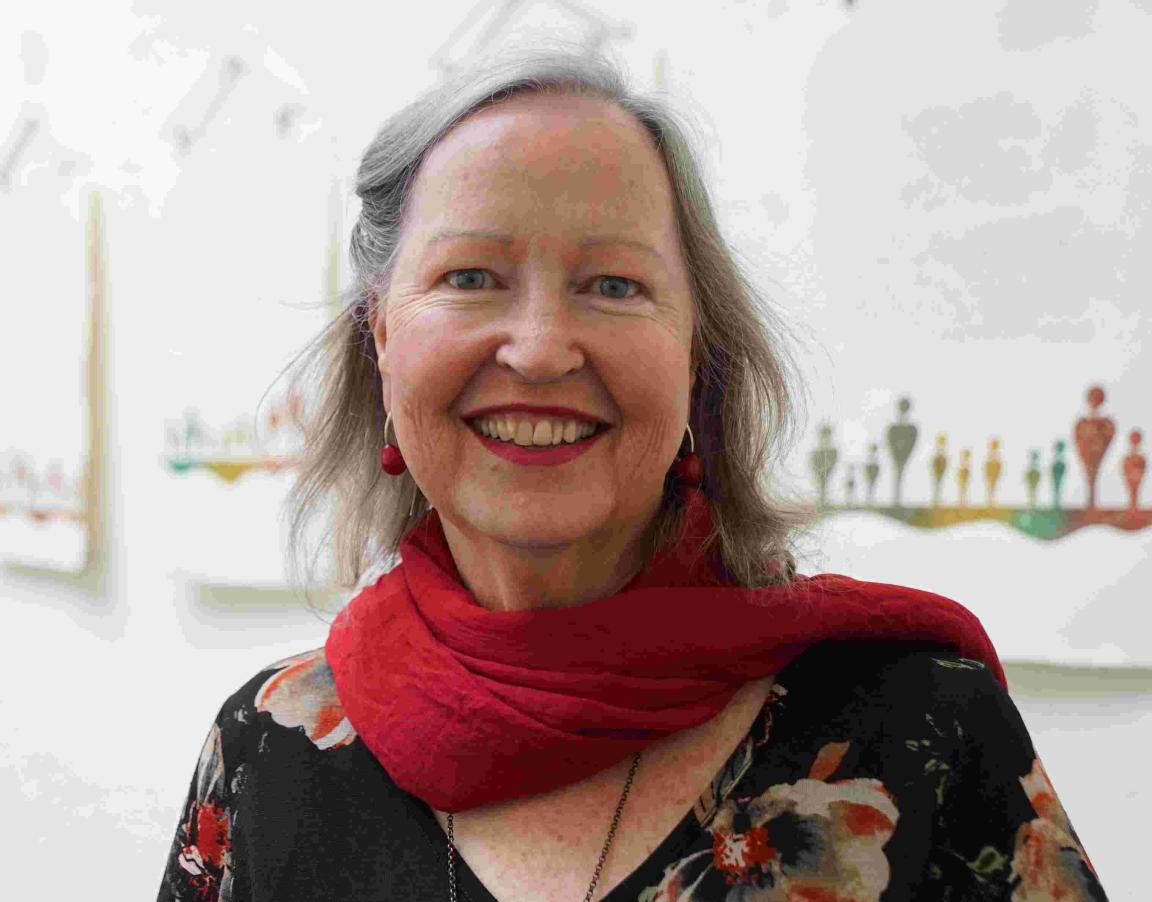
Gemma Black is a distinguished calligrapher, arts practitioner, and independent scholar based in Canberra. Her practice focuses on the creation of formal documents on vellum and fine art paper, heraldic works, book inscriptions, and calligraphic pieces for citations, certificates, and related commissions. Drawing on more than thirty years of teaching, research, and professional practice, she lectures widely and is regularly invited to speak on art, history, the craftsmanship of lettering and the book arts.
A Churchill Fellow and Fellow of the Calligraphy & Lettering Arts Society (UK), Gemma's work is represented in collections including Parliament House Canberra, the Fitzwilliam Museum, Cambridge (UK), the European Parliament, the Museum for International Calligraphy in Moscow, and Stanford University Libraries (USA).
Through her research, teaching, and engagement with cultural collections, she is committed to sharing the rich traditions of the written word and helping preserve the legacy of handwritten artefacts for future generations.

 Assistance animals welcome

 Hearing induction loop

 Wheelchair accessible
Visit us
Find our opening times, get directions, join a tour, or dine and shop with us.